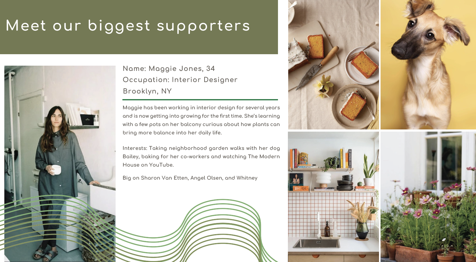
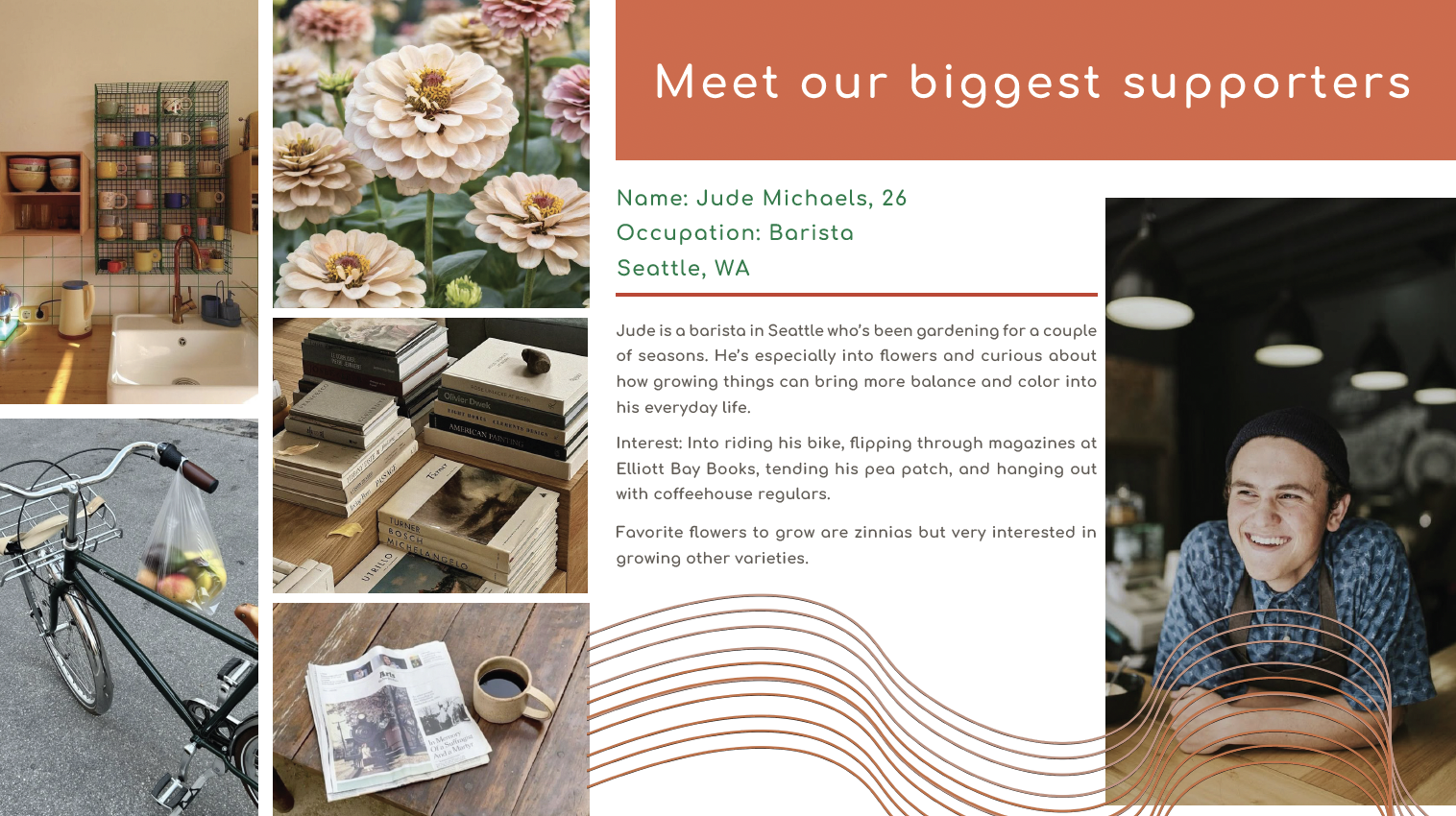
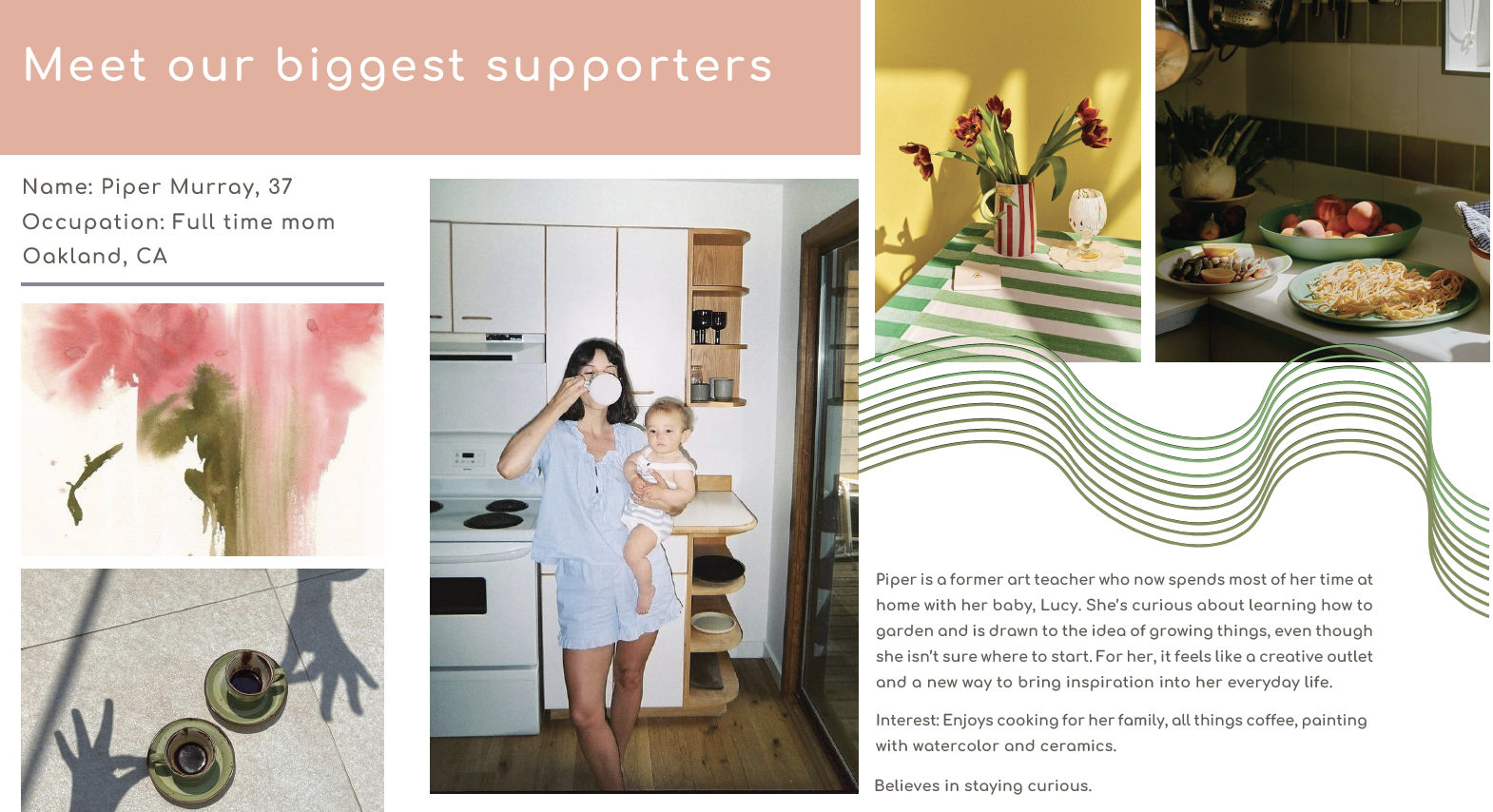
The Process
A look behind the scenes of creating Joey Magazine
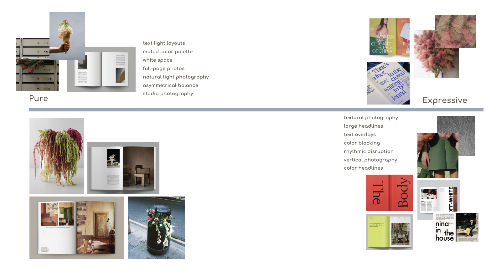
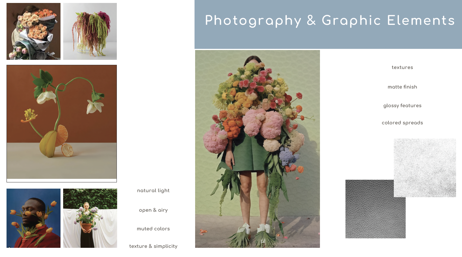
Moodboard
I wanted the magazine to be centered around flowers. The visual direction combines earthy tones with vibrant color, creating a look that feels fresh, sophisticated, and editorial.
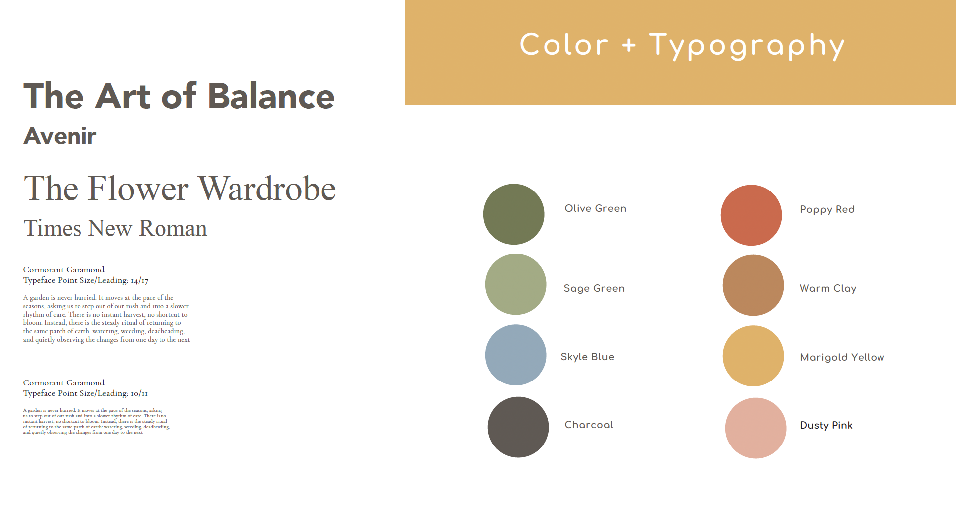
Typography & Color
The typography blends classic and contemporary styles to create a refined editorial look with clear hierarchy. The color palette mixes earthy neutrals with vibrant accents, reflecting both the natural and expressive qualities of flowers.
Flat Plan
The flat plan helped me visualize what the entire magazine could look like, allowing me to balance the layout with the content I had collected. I didn't stick to it completely, but it was a great reference to utilize throughout my design process.
72 pages total
Grid System
I intentionally used the grid as both a functional and visual tool. Text and imagery align to the underlying structure, creating rhythm and balance across the pages, while selective breaks from the grid add emphasis and keep the layouts from feeling too rigid.
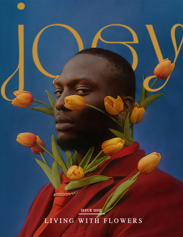
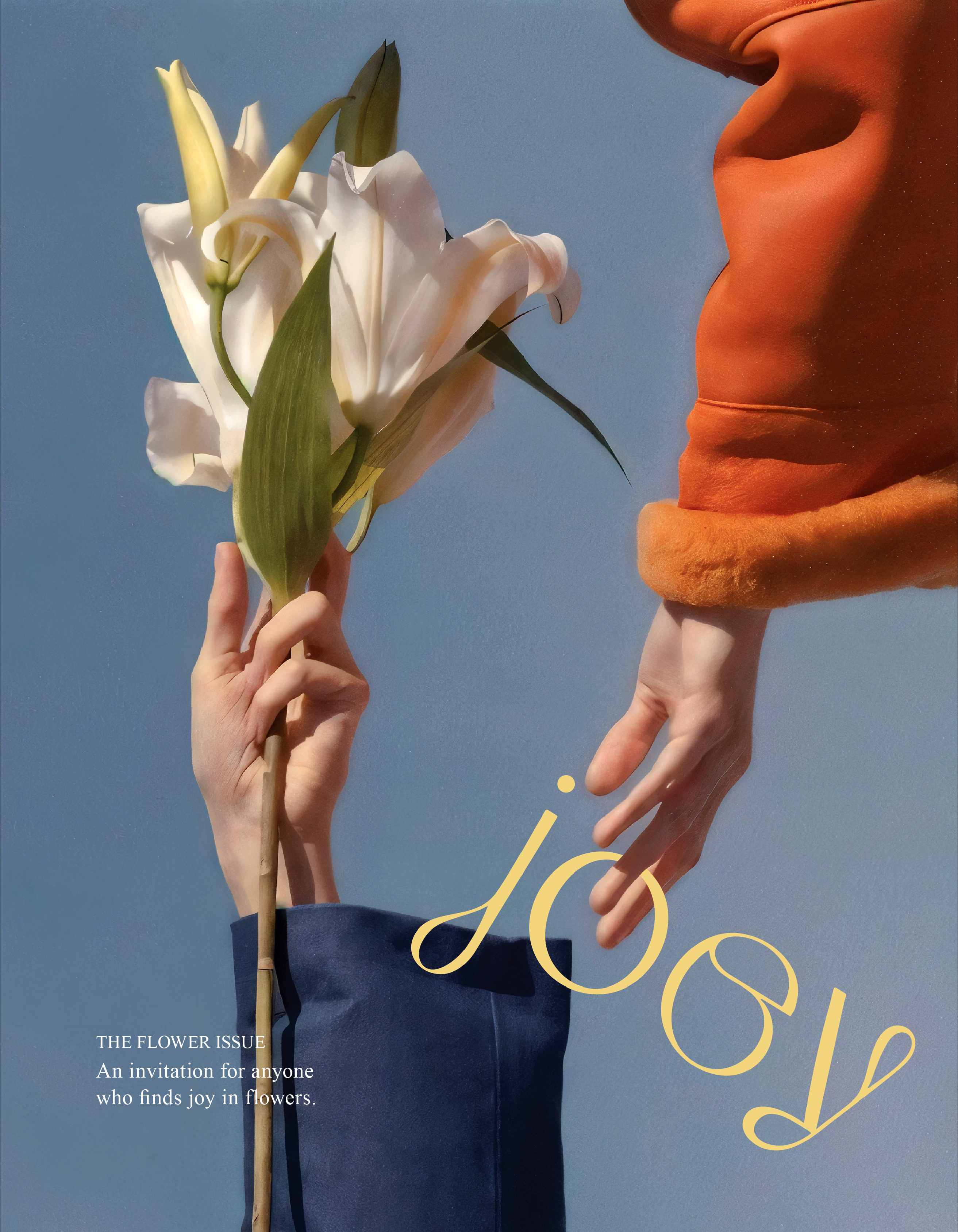
Cover Options
I was torn between the two cover concepts because I liked different aspects of each. In the end, I chose the cover on the right because it felt softer and more inviting, which better reflected the direction of the magazine. However, I think the cover on the left was successful as well, as the mix of edgy and soft elements created a compelling visual balance.