A brand identity for a small neighborhood bakery in Oregon. Think lemonade stand but bakery.
Overview
At hey hôn, we don’t do mass production. We craft baked goods using the best ingredients for the people in our neighborhood or that are in the know. It’s built around the idea that a bakery should feel like a home on the block.
The Problem
The problem was creating a visual identity that accurately reflected Johanna's vision for the bakery while establishing a recognizable and memorable brand that could connect with customers from the start.
The Solution
The solution was to create a comprehensive brand identity system for hey hôn, something rarely afforded to small food businesses. Having the opportunity to help a friend bring her concept to life in a community I'm deeply familiar with made this project feel uniquely personal and intentional.
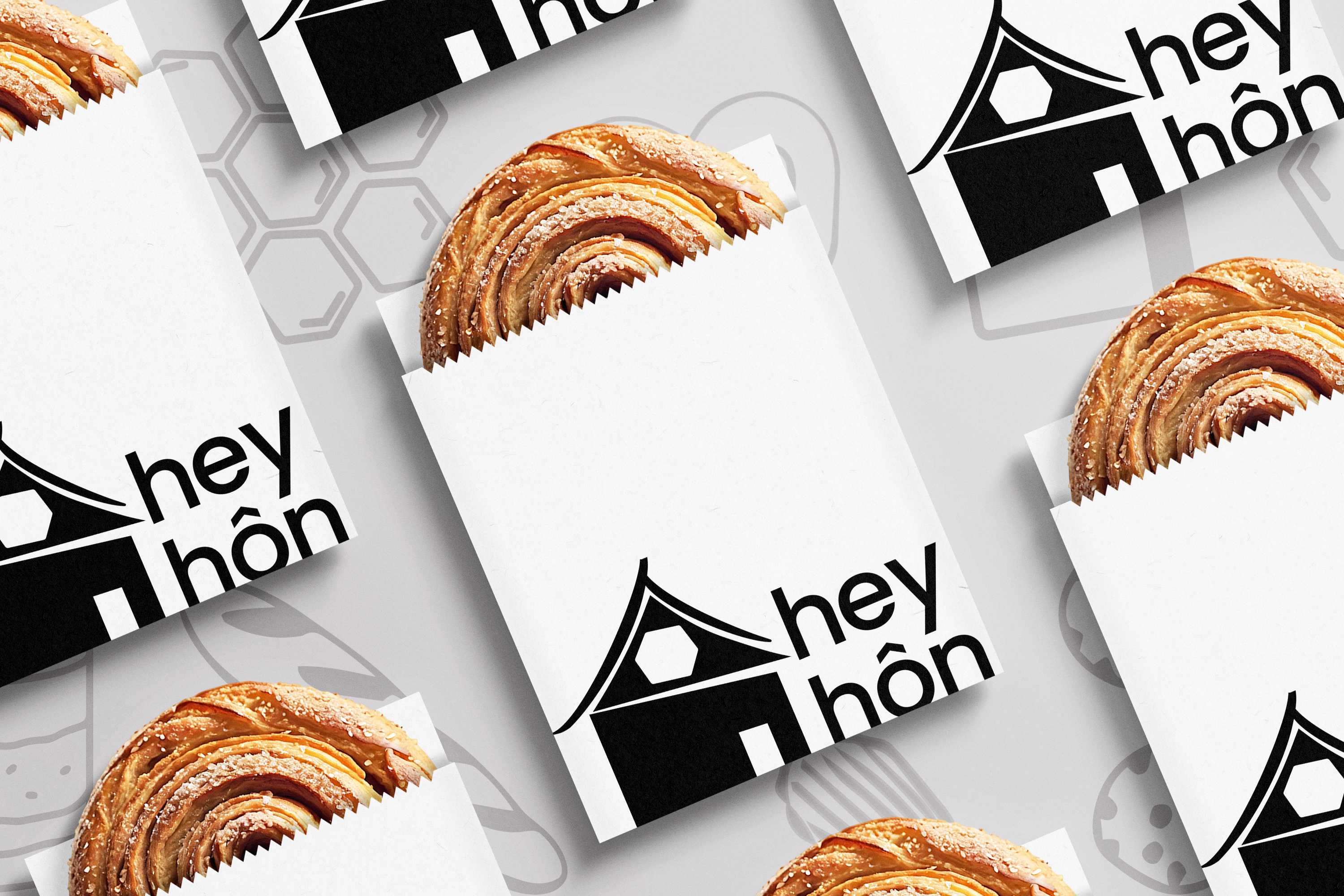
Logo System
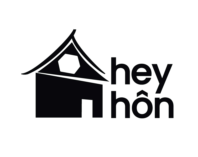
Primary
Combination Mark

Secondary
Brandmark
Tertiary
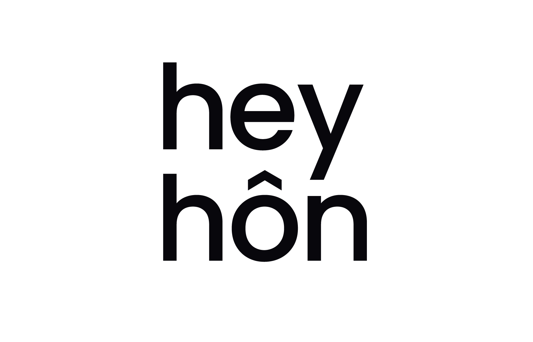
Wordmark
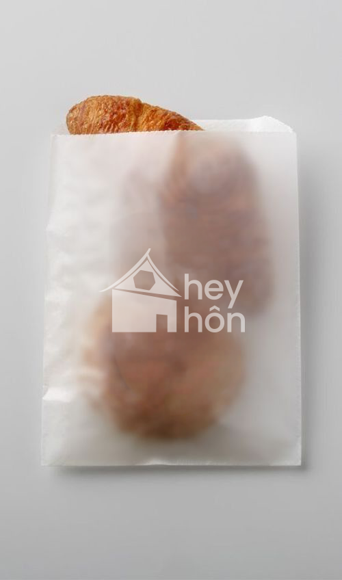
Brand Elements
Brandmark
A stylized house icon featuring a distinctive curved roofline and hexagon window, inspired by the architecture of the owner's home and the cultural heritage of her husband's background.
Typography
Lowercase letterforms that feel personal and conversational. The primary typeface is poppins variable, medium, a geometric sans-serif variable font.
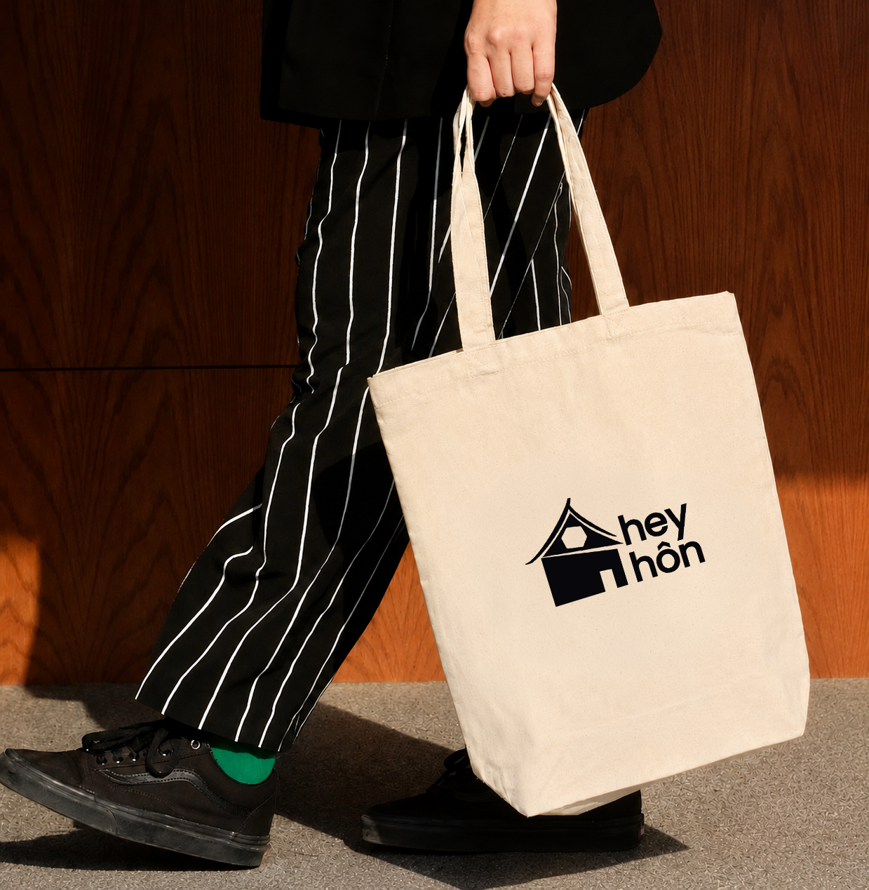
Applications
The hey hôn brand application encompasses a wide range of materials and platforms to bring the brand to life and connect with it's audience effectively.