My Process
Building a brand identity for a neighborhood bakery meant creating something that felt authentic, warm, and accessible. This is how I approached the challenge of capturing the essence of hey hôn.
01 — Research & Discovery
I started by researching other bakeries in the area and throughout Portland. With my background in baking and the relationship I have with the owner, I was able to create a brand identity that truly stood out from the competition.
02 — Inspiration & References
The owners' home architecture and their cultural heritage became central to the visual direction. I gathered inspiration from Japanese aesthetic and leaned into the Wabi-Sabi. I wanted it to feel organic and reflective of the personality the owner has. Nothing is too precious, especially not baked goods.
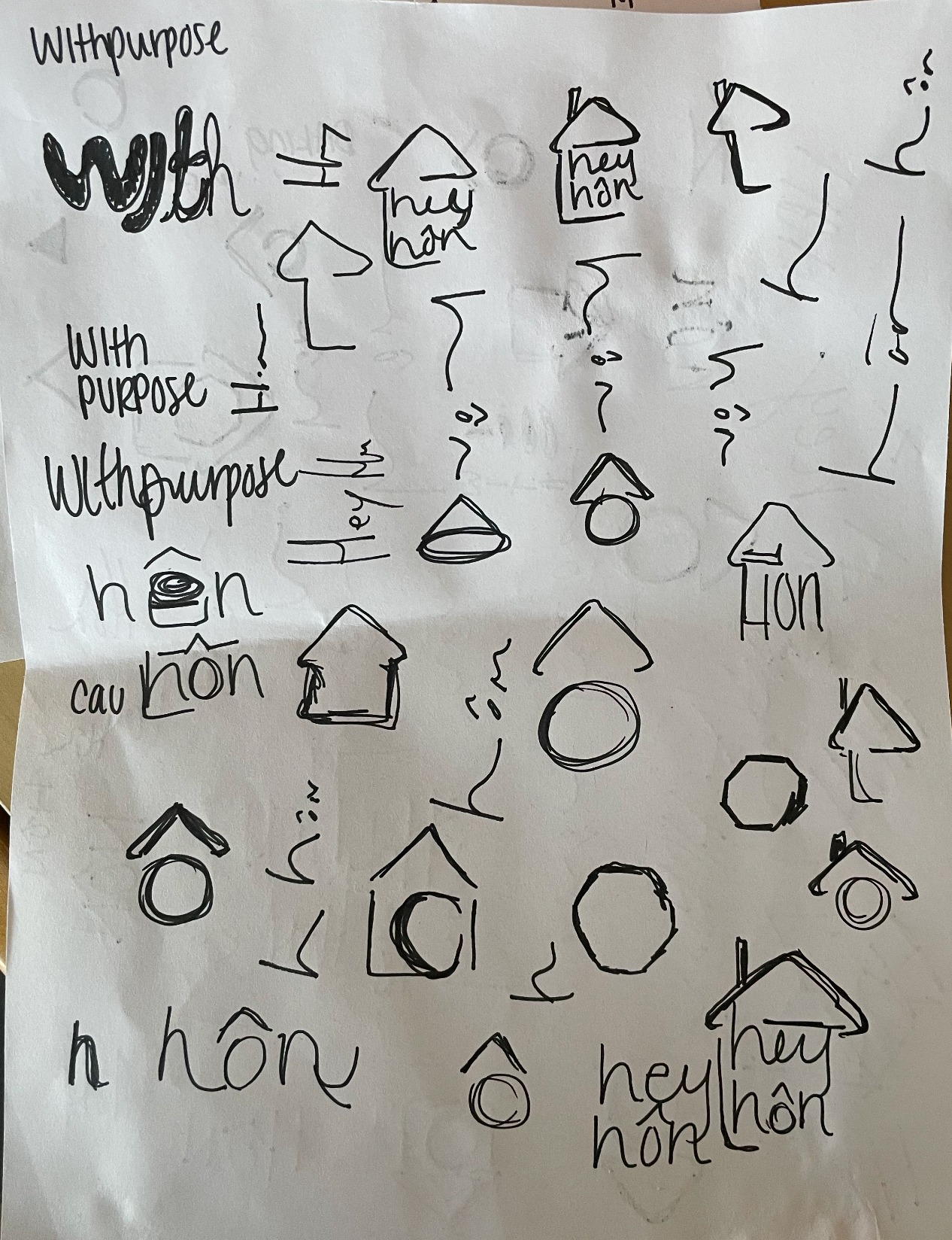
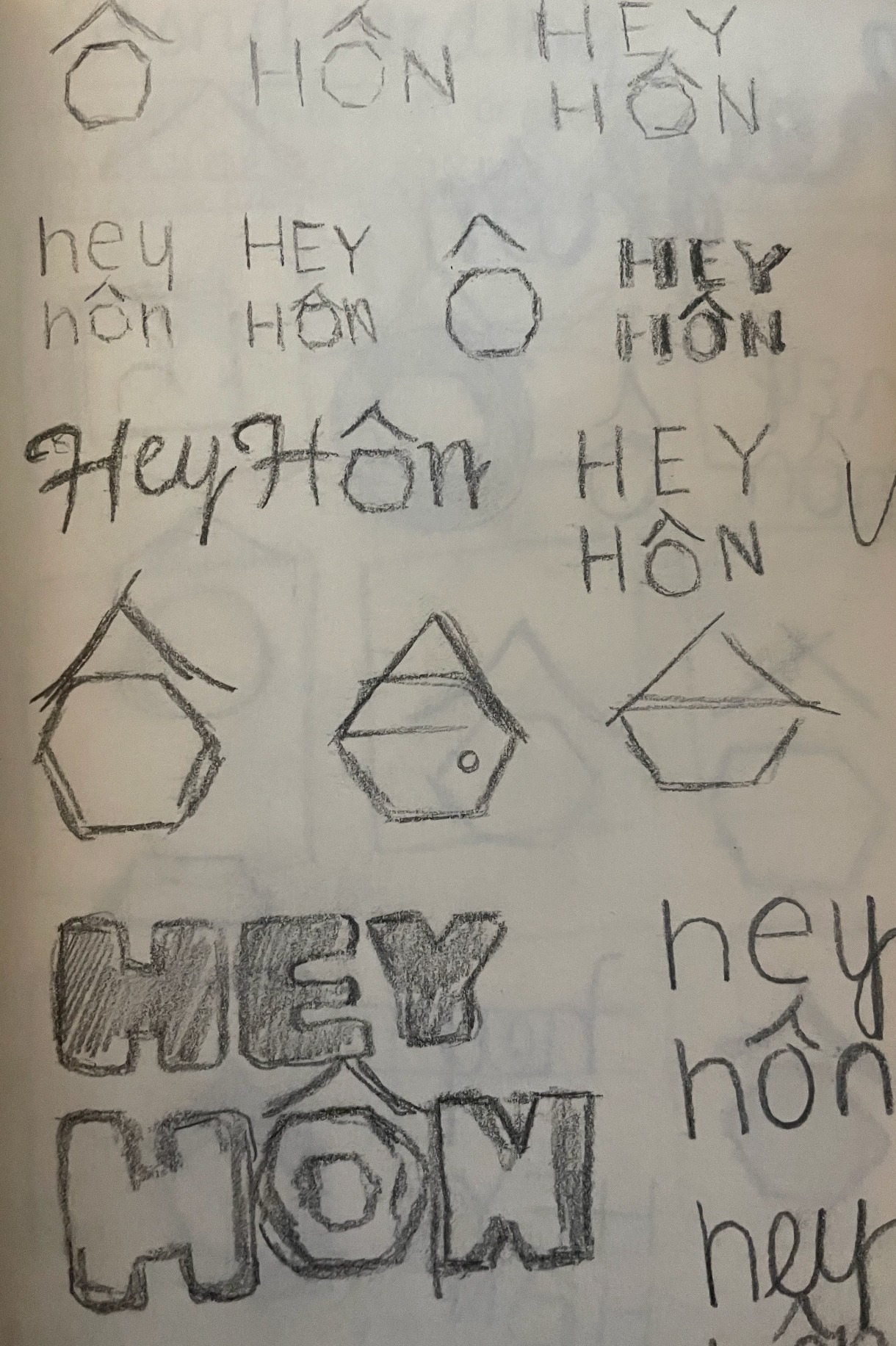
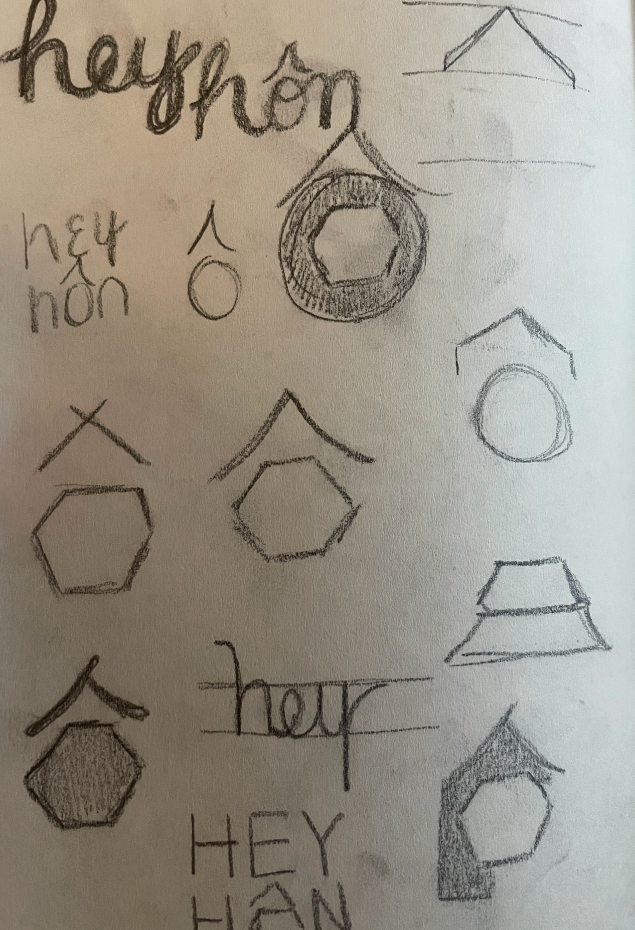
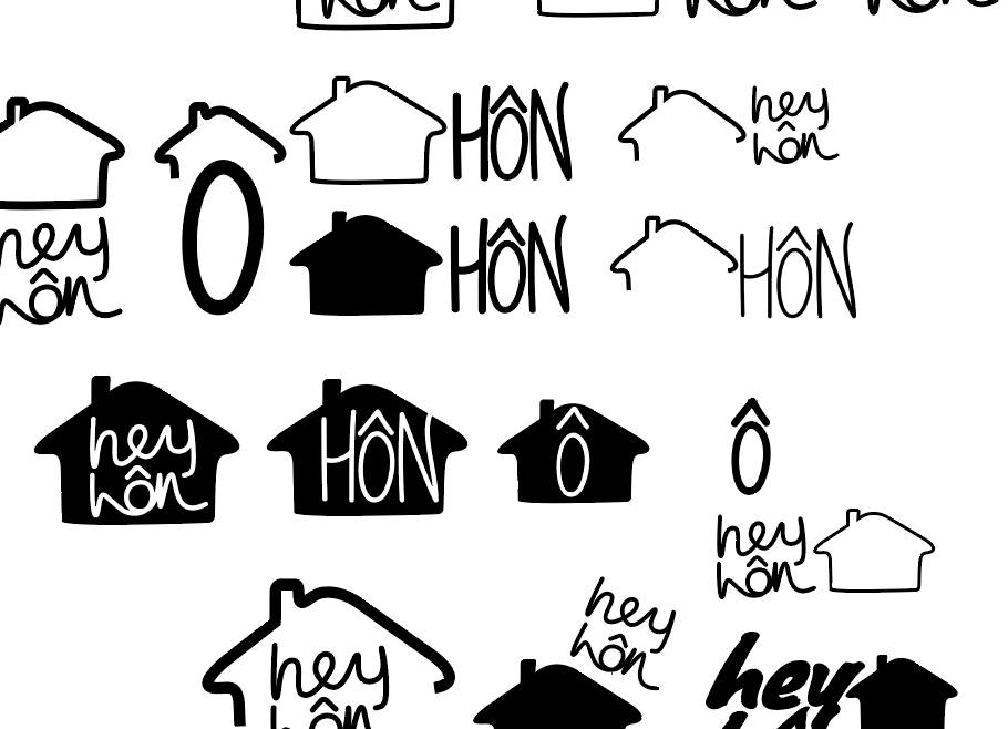
03 — Sketches & Ideation
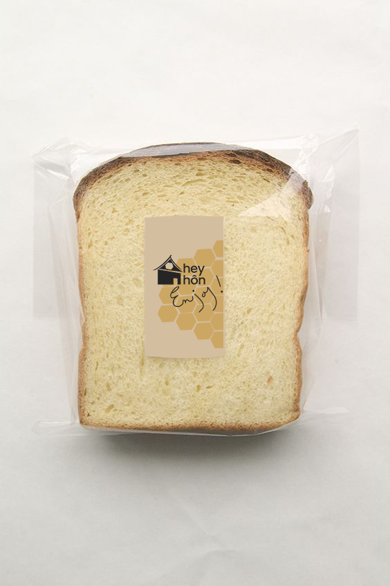
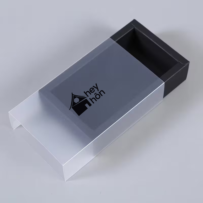
The brandmark started as sketches exploring geometric house forms. I wanted to create something simple enough to work at small sizes on packaging and signage, but distinctive enough to stand alone. The curved roofline became a signature element, and the hexagon window was inspired by the cultural heritage of the owners' background.

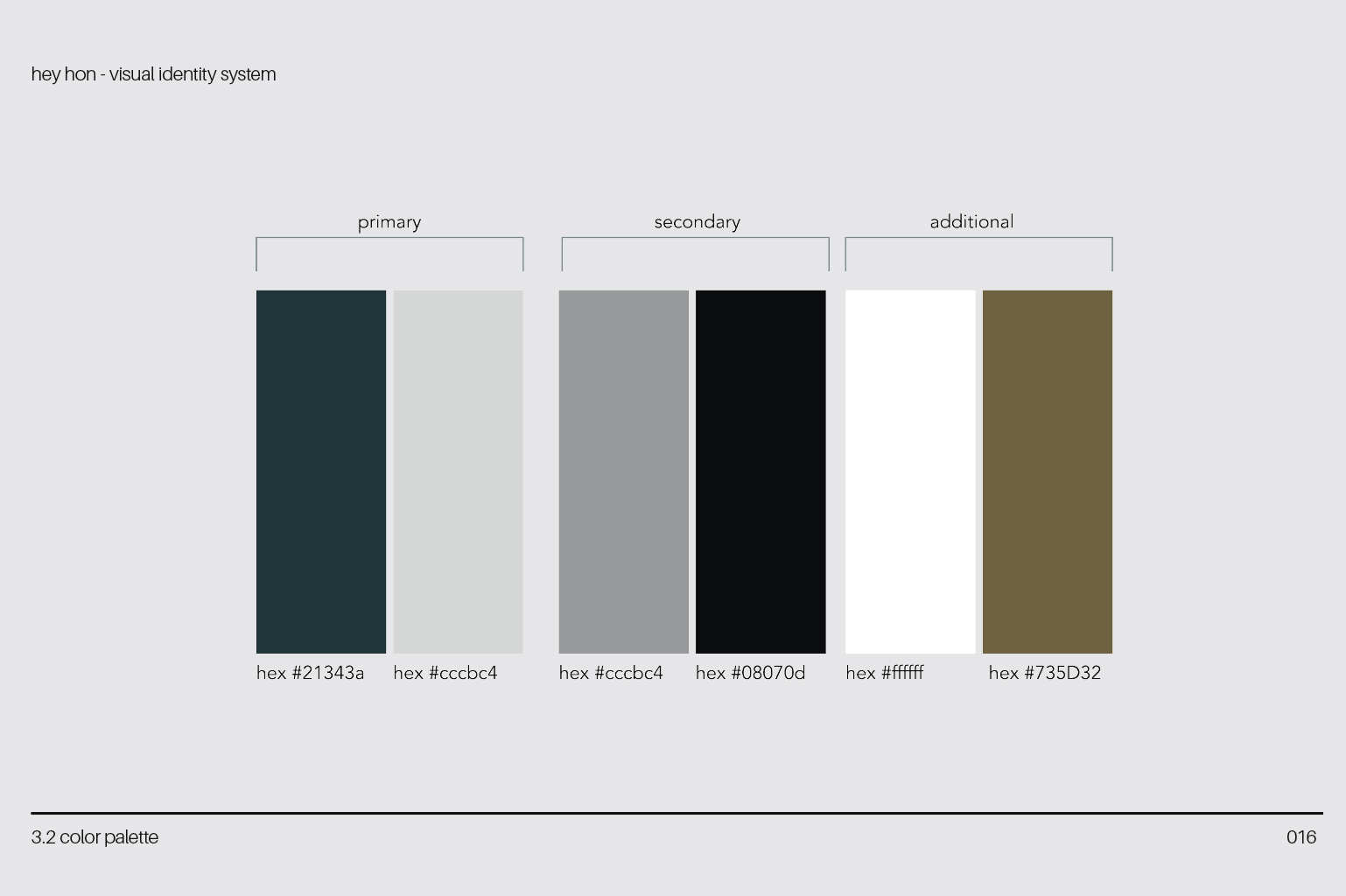
04 — Color Palette
The color palette is drawn from the owner's farmhouse. The gold accent color reflects the honeycomb aspect of the bakery. The client wants to start a small beekeeping operation, so it was a fun way to incorporate that into her brand.
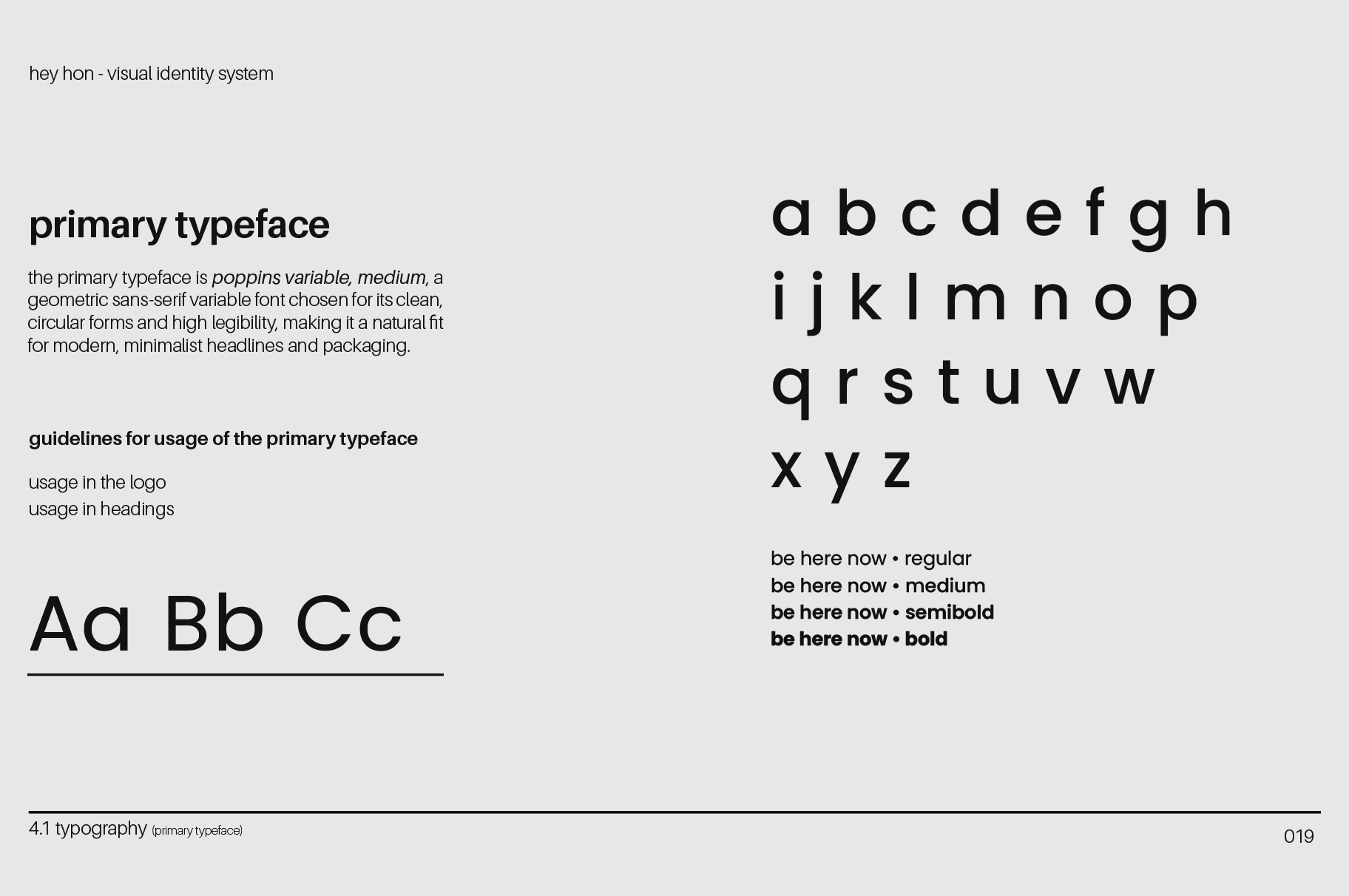
05 — Typography
The brand uses Poppins Variable as the primary typeface which is a modern, geometric sans-serif that feels contemporary yet approachable. All typography is set in lowercase, reinforcing the casual, friendly nature of the brand.
06 — Applications & Iterations
I mostly focused on packaging for hey hôn The bakery is going to have a small footprint, with a very Banksy approach of IYKYK. So, no digital presence.
07 — Reflection
Creating the hey hôn identity was a really rewarding project for me. I'm especially proud of the timeframe in which I developed it, and the final outcome was very well received by my friend and client.